Wednesday, February 25, 2009

Voices


Metric is defined as a way of thinking of a building as a system (Baths of the Diocletian handout).  The handout talked about how the baths were divided into different areas.  One was the caldarium, another is the tepidarium, and the other is the frigidarium.  They were divided by the different temperatures of water.  The cathedrals and churches were also divided into different areas.  They tended to keep the form of the porch, the court, and the hearth.


Finding a precedent is where a designer starts when taking up a project.  This could be of a style of furniture or a building.  The precedent is used to give a basic idea.  In studio, we were divided into groups and each group was given a building as a precedent for their portal design.  The group I am in consists of Chey, Neil, and myself.  We were given Old Saint Peter's cathedral as our precedent.  We are taking the idea of the courtyard for our design by adding a seating area or a bench.  


Presence is the feel a building gives.  An example of this could be the cathedrals.  Their high, vaulted ceilings can create a feeling of power and awe.  For me they create fear due to my extreme fear of heights, but that's just me.  Different spaces let off a different presence or feel.  Some can make you feel relaxed and calm, while others can make you feel energized and ready to go.  For me, Gatewood Studio Arts building has a relaxed feel, but I am still able to focus on what I need to do.


Thumbnails drawings are a good way to show different moments happening, even if they are in the same place.  For example, we were divided into groups in design drawing.  Each group was given a building on campus.  My group got the Mossman building by the EUC.  Even with five people in our group, we all still managed to capture different moments within the building.   

Duality is the interaction between two things and how they work with one another.  With black and white, the black would seem as though it were more overpowering to the white, because our eye is drawn to that point or that area.  It gives us a sense or presence of being mysterious; the unknown.  

All of these words; metric, precedent, presence, moments, and duality; all intertwine with one another.  Precedent, presence, and moments give a person a feel for the space or the building.  They can all be different for different people and can be interpreted in different fashions.  Duality can go along with those by saying that the duality of a work or a space can be taken in a different way for two different people.  Metric has more to do with the design, but can tie with precedent because a precedent can give one the idea for the different areas or metrics.

Thursday, February 19, 2009


Name of Building: Sydney Opera House
Date of Construction: 1957 - 1973
Architect: Jorn Utzon
Location: Sydney, Australia 

I chose the Sydney Opera House because of its interesting and different form.  It is a very intricate looking building for the time period in which it was built. “The Sydney Opera House is a great architectural work of the 20th century that brings together multiple strands of creativity and innovation in both architectural form and structural design” (Sydney Opera House).  This was a design that nobody, during this period, would have dared to try, because of the structural issue involved.  I thought that it would be interesting to look at this building and see how it was able to be achieved.  I saw many different buildings and was drawn in by this one, because of the design and it is interesting to see how the space within works with exterior.

Wednesday, February 18, 2009

Divide & Conquer


Designer: Stephen Gardner
I felt that this perspective was more slow and deliberate.  It really shows the character of the part of the city in which the designer is located.
Designer: Samantha Zaza
This one is more energetic and engaging.  It shows the people interacting with the area around them.
Designer: Richard Camara
This perspective drawing is very deliberate.  It really relays the intricate details in the walls .
Designer: Gabi Campanario
This designer catches the moment and is able to convey what is happening at this McDonalds.  It is more energetic and engaging.  She was trying to get what she could while all of the cars and the people went about their business.


Designer: Gabi Campanario
This is by the same artist as the McDonalds perspective.  This one, however, is more slow and deliberate.

Tuesday, February 17, 2009

Parts:Whole


Order refers to the different types of columns developed over the years.  The orders from least ornate to the most are doric, ionic, corinthian, and composite.  When we looked at the Acropolis, the Parthenon has doric and ionic columns while the neighboring Erechtheion has ionic columns.  "Although the temple was built with the Doric order, massive and austere, and benefitting the goddess of war, the roof of the Parthenon chamber was supported by more delicate Ionic columns" (Roth 236).  The orders were used to show hierarchy.  Then, when we look to Rome, we see that the Colosseum has utilized the doric, ionic, and corinthian orders in the decorative architecture of the building.  Doric is found at the bottom and corinthian at the top. 


Entourage is one's environment or surroundings.  In Suzanne's drawing class, we have been working in groups on a building on campus.  The group I am with got the Mossman building.  The drawing is actually from Human Resource Services, which is located on the first floor of the building.  It shows the area just inside the office and the area surrounding it in the main area of the building.  "At the base of the Acropolis, paths leading out to the surrounding farms eventually became streets, and along one of these, Northwest of the mass of the Acropolis, a roughly triangular, open space was set aside as the agora, whose boundaries were defined by the surrounding houses and public buildings" (Roth 222).


The Parthenon is a good example of hierarchy, because it is the largest building on the Acropolis.  Also, all of the other buildings on the Acropolis face the Parthenon, which, in turn, draws the eye towards it.  In drawing, hierarchy can be shown by what is closer.  These parts of the drawing are larger than the rest, so they stick out more.  Hierarchy can be shown from architectural structures, to furniture, to simple sketches.  "By far the most important Greek building was the temple.  Although it served a most vital public function and was a symbol of the polis, it was not a public building in the sense that we use the word, for only priests and selected individuals actully entered it" (Roth 229). 


Archetype/Prototype/Hybrid.  These are the process in developing a piece of architecture or even a piece of furniture.  For example, the temple (Megaron) had to go through many changes to reach the desired look, the look of "perfection".  

Source is the place at which something, such as an idea originates.  The source for the temples of Greece would, of course, be the designers and architects who came up with the ideas.  However, the ideas and the "images" of the building itself needed to be spread around.  To do that, people who had seen the building would talk about it and eventually the ideas would spread all over the Grecian Empire.  This is why several buildings can be found with a similar style, but be in completely different places of the empire.  "The ancient Greeks learned much from Egypt, apparently adapting their earliest sculpture and post and lintel stone architecture from the Egyptian models" (Roth 215).


Tuesday, February 10, 2009


              Scale is used for many different things in Architecture.  In drawing, whatever is closest to you is bigger and as it moves back, it gets smaller.  So if you had a crowd of people, then the people in front would be larger in scale than those in the back of the crowd.  Also, scale is a way of showing power or hierarchy.  This is shown in the pyramids, ancient Greece, and many other places all over the world.  Normally, the larger buildings have a religious or political use or power.  We also use certain scales to show a room, building, or piece of furniture in a smaller way, so as it will fit on paper or board.  One example of this was drawing a plan view of Pat's chair in 3": 1' 0" scale. 

Unity can be the relationship between two drawings, to spaces, or to different cultures.  One example of this was discussed a week or so ago in History.  Similar architectural styles can be found between places half a world away from one another.  The Aztec pyramids in Mexico and the pyramids in Mesopotamia have the same stacked formation, however, they were on opposite sides of the world.  Unity was also a major issue discussed in the workings of the Pathways, Edges, and Boundaries project.  The issue was creating designs specific for each area, but still maintaining a sense of unity between all of the groups.
                     
Vignettes are a way of showing a scene, but not showing everything within the space.  In a vignette, there are no definite ending lines.  The ending lines trail off, giving you a less defined space, where watercolor or whatever coloring medium does not have to follow any definite ending points either.  


In drafting, we had to do two sections of Pat's chair.  I picked two points at which to "cut" the chair.  Where the chair was cut, I poched to show that these were the parts that had been cut.  A section shows what is inside the structure.  In a house or other building, a section would show the pipes and wiring within a wall.  These are features not normally seen in an elevation or plan drawing.  


Boundaries are a way of defining a space.  My drawing actually shows a lack of boundaries.  This is determined by the edges and lines that just fade out instead of coming to a definite end.  Boundaries are currently an important topic and issue in the Pathways, Edges, and Boundaries project for studio.  We are designing and installing artifacts for each given space, however, each space has certain boundaries.  Some are definite, such as street curbs or sidewalks and others, such as the wires that run for the emergency pole, are not clear boundaries.

Each one of these words comes from at least on class specifically.  I relate sections more towards drafting.  Vignettes to drawing.  Boundaries toward studio.  Scale goes towards all and is seen in all, because scale is a major part of drawing quality and architectural details and accomplishments. 

The Three Spinners

I think I could have represented my story line and its main themes a little better.  I actually had a different view on the story than Phillip did.  He looked more towards the idea of deception and I focused more on the characters and how they affected the story.

Tuesday, February 3, 2009


When you illuminate a picture or drawing, you are making it pop from its background; making it stand out.  The pyramids in Mexico are actually illuminated by the surrounding area.  The green in the forest and landscape make the brown of the stone temples stand out.  This draws attention to them.
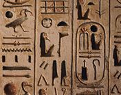
An Idiom has to do with the language or dialect of a society.  The Egyptians used hieroglyphics as their written language.  They used it to tell the stories of the gods and of the pharaohs.  "Scribes and artisans [also lived reasonably well], for their skills were crucial to the operation of the temple services and the creation of inscriptions and paintings in the temples and tombs" (Roth 209).  These inscriptions were deeply cut into the stone so a to stand the test of time. 
  

Materials are a very important part of design.  Certain materials aid in the firmness or strength of a building.  Materials also have to do with what you use to do a drawing or painting.  For example, I used watercolors, pen, and colored pencil.  The Egyptians had to find a material that was available to them in the desert.  They found and used a type of sandstone, which was used to build their temples and the pyramids.  This material had to strong enough to last forever, due to the Egyptian's beliefs in an afterlife.  


Commodity is the usefulness of a space or an artifact.  For Pat's chair, I did a chair and table combination with a shelf.  This could be used for many things, such as working, eating, or just relaxing.  Sir Henry Walton stated, "In architecture, as in all operative arts, the end must direct the operation.  The end is to build well.  well building hath three conditions: commodity, firmness, delight."

If a building or an artifact does not have firmness, then it will not be able to stand over time.  A good example of firmness are the pyramids of Giza.  They were built from a strong stone and in a shape that is able to withstand the pressure of gravity.  This is why they are still standing.

Delight is simply pleasing to the eye.  The Great Wall of China shows delight, because it moves with the land.  This makes it pleasing to the eye, by flowing smoothly and having smooth curves.  Decoration of an artifact of space can also fill the qualification of delight.  

All together, these features combine to create an artifact, space, of piece of architecture that is useful, able to withstand the test of time, and be pleasing to the eye.  All architecture and design relates back to these points to make is successful.  

Pursed Lips on the Train (posted by Jason Das)